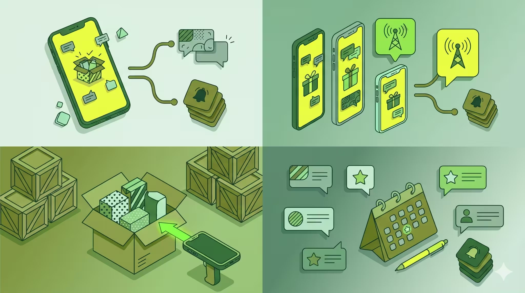
There’s one part of your communication that is usually missing— re-engaging shoppers who viewed a product but didn’t purchase. When we launched browse abandonment notifications, many merchants were able to successfully capture shoppers at this stage of the funnel.
But you don’t need to always remind shoppers about the product they viewed. Your browse abandonment notification can just be a way to incentivize shoppers and remind them why your brand is worth buying from. Since these notifications are in a sequence, you can use different strategies to keep the communication interesting and drive subscribers to click through and shop.
We’ve listed 6 strategies and copy ideas that will help you set up browse abandonment notifications that are engaging:
Not using the automation? Read how browse abandonment notifications work and why you need to set them up.
6 Strategies and Copy Ideas for Browse Abandonment Notifications
1. Personalize your notification with product name
To be truly effective, these notifications should be personalized to the customer who is receiving them. Without context, your browse abandonment notifications would seem like any other notification that your shopper gets, making them less likely to click.
Using placeholders, you can add the product and customer name to address shoppers directly and remind them about the products they looked at.

2. Use a conversation starter to nudge them to continue browsing
These notifications are meant to re-engage interesting shoppers but you don’t need to stick to the product they looked at. Instead, you can turn one of the notifications in the sequence into a conversation starter, nudging your subscriber to take the first step and reminding them what they’ll gain by shopping one of your products.

3. Include any currently running discounts within your message
If you have a special offer on your store, let shoppers know about it. Since they’ve already shown interest in one of your products, an additional discount will nudge them to take action and buy from you.

4. Use guides and quizzes to help shoppers find the right product
If you have a lot of products, your shoppers may need a little guidance to figure out which one is right for them. You can use one of your browse abandonment notifications to take subscribers to a quiz that helps them choose the right product based on their needs.
INH Hair informs shoppers about its color matching guide within its 2nd browse abandonment notification, guiding shoppers to the right shade and product for themselves.

5. Inform subscribers about your product’s benefits
What makes your products better than others? Use your browse abandonment notifications to convince customers that are on the fence about your products and show them what makes your products unique, whether it’s a health benefit or the ingredients you use to make them.

6. Highlight freebies, if you’re offering any
Everyone loves freebies! If you’re offering them, even for a limited time, make a mention of it in your browse abandonment notification.
Planet of the Vapes offers freebies and makes it clear in their browse abandonment notification, assuring more clicks and a higher session duration from these shoppers.
Re-engaging your shoppers with compelling strategies
We hope this helped you set up browse abandonment notifications that interested shoppers actually want to click on.
Here are other resources on Browse Abandonment Notifications:
📚 Browse Abandonment Notifications: Guide to Re-Engaging Shoppers with Web Push
🛠 Help documentation on Browse Abandonment Notifications


